Principles
Successful typography is based on some basic typographical principles. Understanding these principles will ensure legibility and recognition wherever people encounter the Volvo Cars brand.
Hierarchy
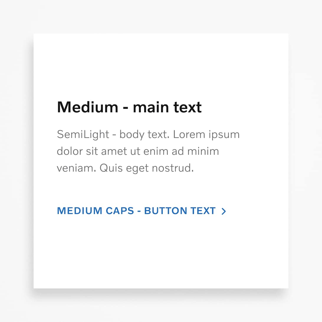
A clear hierarchy of type sizes helps people understand the order of importance of the information we're sharing. Use different sizes and weights to establish this order. We use sentence case in titles, headings and labels. That means we capitalise only the first letter of the first word.
.png?w=1920)
.svg?w=1920)
Type colour
As well as adjusting size and weight, colour can also be applied to type, to help communicate visual hierarchy. For instance, headings can be set in black, body copy set in grey, and interactive button text can be set in blue. Learn more about UI colours.
Letter spacing
Letter spacing is the space between the letterforms of words. The main purpose of letter spacing is to improve readability. We can use the default letter spacing in most cases, and adjust as needed.


Line height
Line height is the space between individual lines of text. The main purpose is also to improve readability of the text. The optimal line height value depends on the context. We adjust line spacing based on the number of words in relation to white space, type sizes, and the overall visual expression.


Alignment
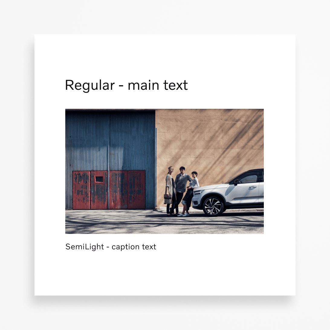
Type alignment defines how lines or paragraphs of text are positioned. Left-aligned text is preferable to optimise readability. When using this alignment, make sure the right edge is well-balanced visually. Avoid single words ("widows") on a single line.
.svg?w=1920)
.svg?w=1920)
Line length
Line length determines the number of characters per line. For optimum readability, keep within the recommended ranges shown below.
Contrast
Ensure the text in your designs has enough contrast with the background to maximise legibility. Use a dark text colour on light backgrounds and a light text colour on dark backgrounds. The minimum acceptable contrast ratio is: 4.5:1 in most cases, and 7:1 for more critical system feedback–like that of in-car UI.


Type on imagery
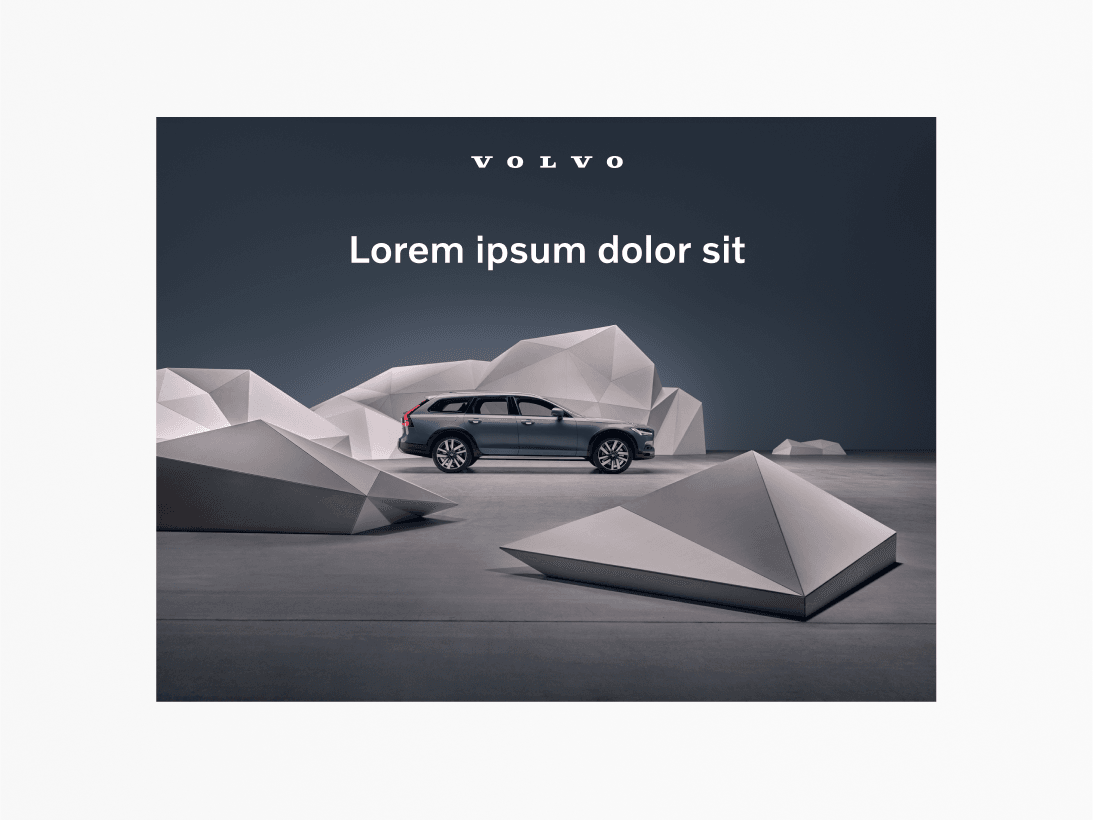
Black or white typography is used on our images, with the choice being determined by contrast with background colours and tonality. For instance, black typography is used on a light background, and vice-versa. When used in close proximity to our logo, the typography and logo should have the same colour.
.png?w=1920)
Incorrect usage
Here are some examples of common typographic mistakes.


