UI colours
Carefully select and apply user interface (UI) colours. Use them to communicate visual hierarchy, guide interactions and create a consistent brand identity.
Blue primary
The primary Volvo Cars brand colour is blue. Apply the blue colours sparingly in product interfaces. Brand colours should be used only to establish the Volvo Cars identity and communicate interactivity.
Our primary blue is contrast-compliant as a fill colour with white text overlaid.
HEX #284e80
Blue accents
The Volvo Cars accent colours are brighter blues. Use them for links, selections and other interactive elements. To meet colour contrast standards we have two accent colours: one for our light UI theme, and one for our dark UI theme.
HEX #1c6bba
HEX #1f78d1
Themes
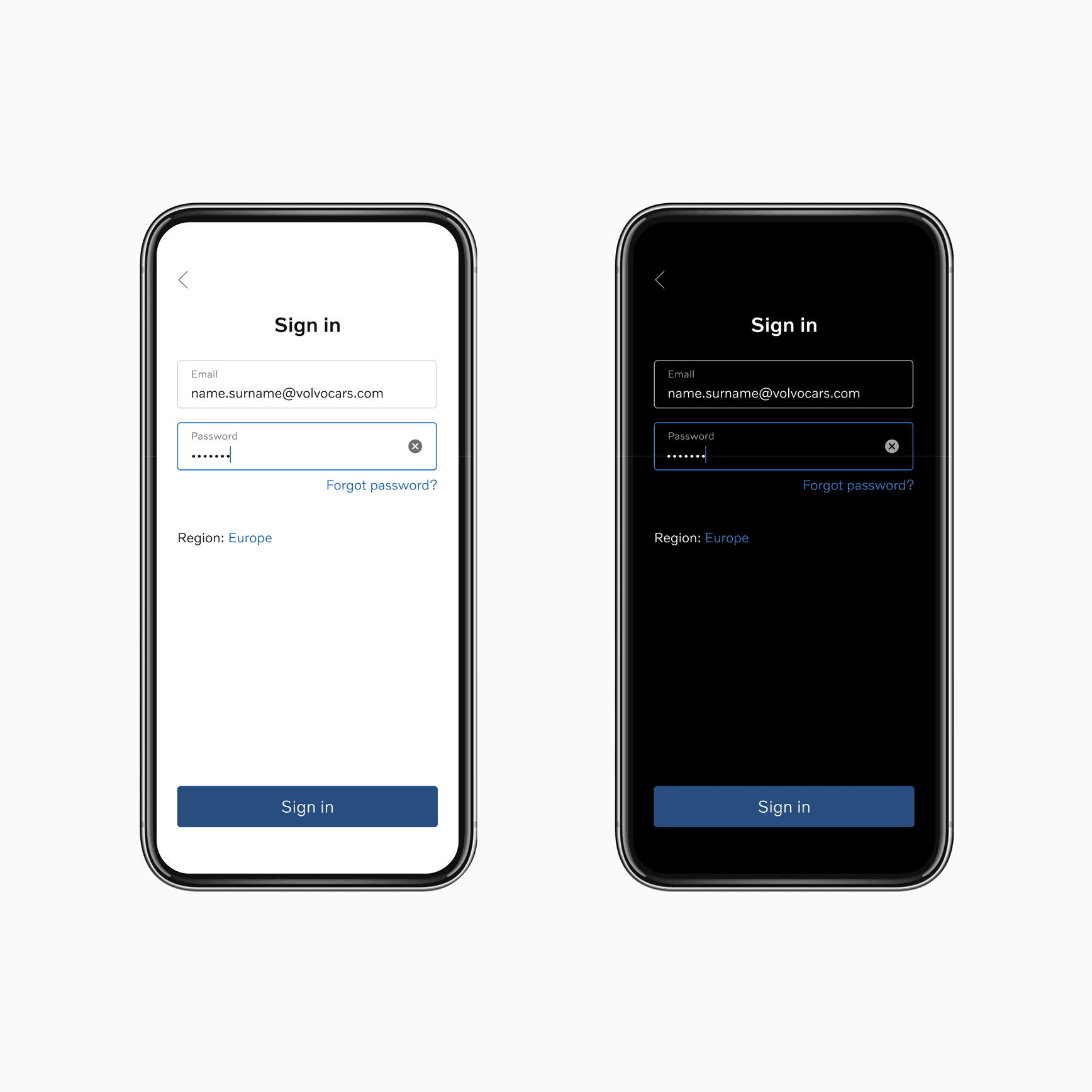
Our design system offers two distinct themes to support light and dark UI creation. Both themes include specific foreground and background colours. Our palettes are optimised to meet colour contrast compliance.
rgba(0, 0, 0, 0.96)
rgba(0, 0, 0, 0.64)
HEX #2a609d
HEX #bf2012
HEX #d5d5d5
HEX #ebebeb
HEX #ffffff
HEX #fafafa
Examples
Proportions
The following colour proportion wheels help you understand the overall balance of colour usage across Volvo Cars for both light and dark UI themes.

Usage
Every colour plays a specific role when applied to UI. Some colours show up constantly, while others play a subtle, more supportive role. To ensure consistent colour usage, we offer the following guidance.
Background / primary
Use as the primary background colour for light UI.
Background / secondary
Use as the secondary background colour for light UI.
Foreground / primary
Use for styling primary content such as text and icons. May sit on top of any light UI background colours.
Foreground / secondary
Use for styling secondary content such as text and icons. May sit on top of any light UI background colours.
Blue / primary *
Key brand colour. Use to style primary UI buttons (call-to-actions), which contain white text labels. Only use as a primary button fill colour.
Blue / accent
Use the accent colour to style standalone buttons/links and selected UI states within light UI. May sit on top of any light UI background colour.
Alerts
Use for highlighting errors, invalid data and destructive actions. May sit on top of any light UI background colour.
Ornamental / border
Use to visually group or separate UI elements within light UI.
Ornamental / divider
Use to visually group or separate UI elements within light UI.
Contrast ratios
We have ensured that all critical colour pairings meet the minimum accessible contrast ratio set by WCAG (AA, 4.5:1). This applies to all colour pairings across both light and dark UI themes.
Foreground colours on primary background colour

Foreground colours on secondary background colour

Button label contrasts
