Typefaces
Typography is a vital component of our brand communication. Consistent typographic elements ensure legibility and brand recognition when people interact with our designs across platforms.
Overview
Our typefaces are Volvo Novum, Volvo Antikva, and Volvo Broad. Our design system includes support for Extended Latin, Cyrillic, and Greek characters. We use British English as the default language in design files.
.png?w=1920)
Volvo Novum
Volvo Novum is our default typeface for most texts, including headings, subheadings, introductions, body copy and captions. This typeface is legible, functional and has enough weights for useful variation. The set includes a total of 10 fonts, with five options for italics.
Usage
Examples of Volvo Novum typeface usage.
.svg?w=1920)
.png?w=1920)
.png?w=1920)
.svg?w=1920)
Volvo Antikva
The Volvo Antikva typeface is for use in editorial content, captions and quotes. The typeface is available in 5 weights, including Roman and italic, for a total of 10 fonts.
Usage
This is our "story" typeface. It's used for quotes where we give a voice to people or stories. In some instances, it can be used stylistically. Volvo Antikva should be used sparingly.
.png?w=1920)
.png?w=1920)
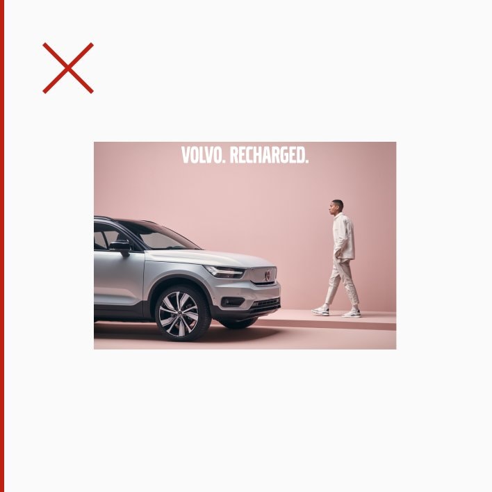
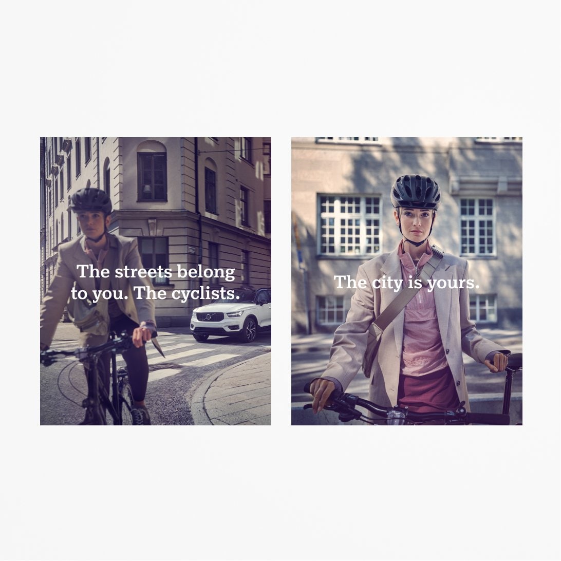
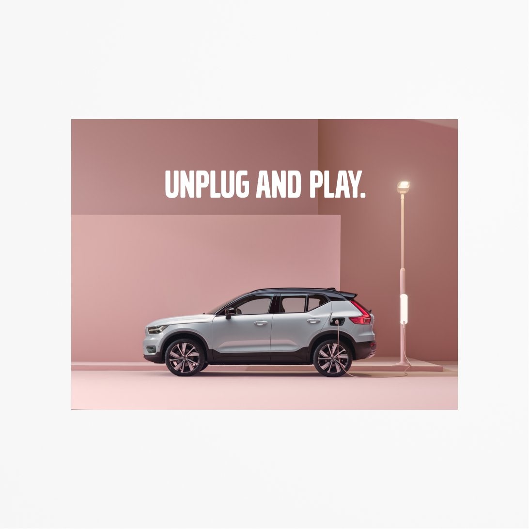
Volvo Broad
Volvo Broad is a strong signature of our brand. It is our iconic typeface that provides impact and recognition.
.svg?w=1920)
Usage
Volvo Broad is used only for short statements or carefully selected messages. Please use as directed in brand assets for specific campaigns. Never use Volvo Broad for body copy, headings or detailed information.
.svg?w=1920)
.png?w=1920)
.svg?w=1920)
Incorrect usage
Here are examples of what to avoid when using Volvo Broad.