Scaling / Styles
We use a global type scale for all user interface (UI) designs to help us ensure brand consistency. The global type scale follows a numeric rhythm and offers a range of text sizes. It's the foundation for refinement of local type scales for specific platforms.
How it works
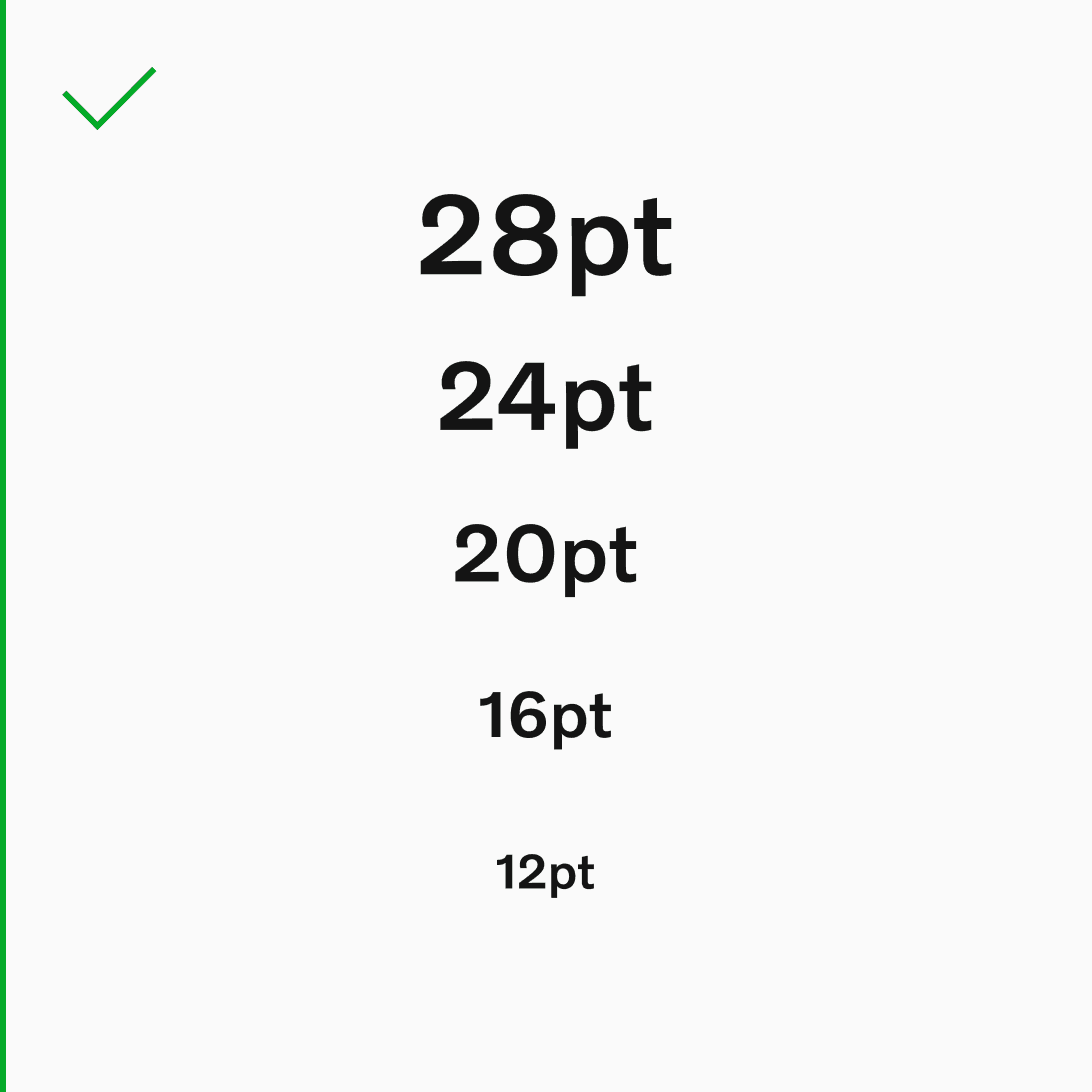
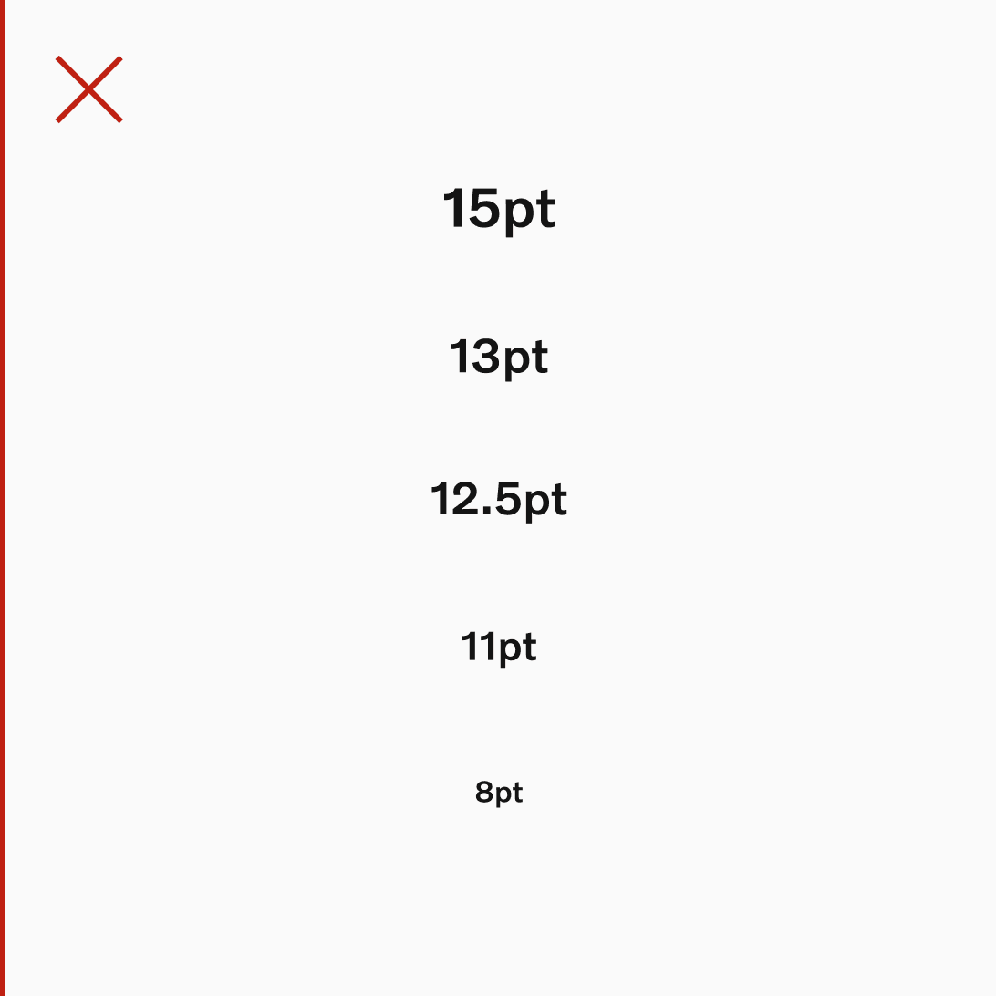
Text sizes across Volvo Cars UI are scaled and sized consistently. To maintain this rhythmic scaling, each text size grows up or down in increments of 4 and 8pt, expressed in code as 0.5 and 1.0.
.svg?w=1920)
Global and local type scales
The global UI type scale is a large ladder of text sizes to be referenced by designers as they begin creating type scales for specific platforms.
Local UI type scales are groups of text sizes used within specific platforms. These sizes possess a hierarchy, are derived from the global scale, but are selected specifically to meet the requirements of a given platform.
Global type scale
Reference the global UI type scale when creating local UI type scales (that are platform-specific).
The smallest text size on the global scale is 12pt, which is expressed as 1.5x.

Local type scales
Local type scales are published and accessible for use by enabling the relevant design system platform libraries.
When creating a local UI type scale, use text sizes that appear within the global type scale. Keep the amount of text styles (and any weight variants) to a minimum. Only add styles when absolutely necessary.
Begin by auditing a range of UI views on the platform. Categorise every typographic variation and its usage. Then pick the ideal text sizes from the global type scale to cover all use cases.
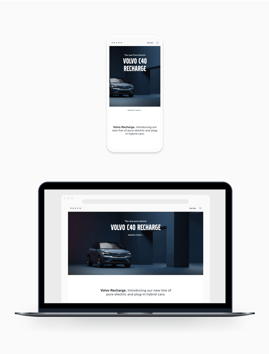
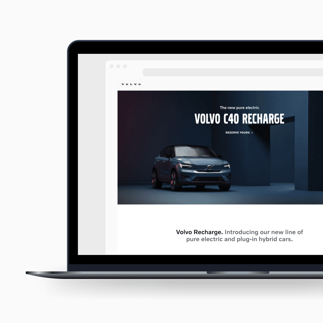
Local type scale - example
For context, here's an example of the local type scale currently used across the mobile platform at Volvo Cars. This scale features 4 roles, and contains 11 text styles.
Local type scales are stored (and published for use) from their respective platform libraries.
Headings
4x = 32/36
Ag
Volvo Novum
Medium
3x = 24/28
Ag
Volvo Novum
Medium
3x = 24/28
Ag
Volvo Novum
SemiLight
Subheadings
2.5x = 20/28
AgVolvo Novum
Medium
2.5x = 20/28
Ag
Volvo Novum
SemiLight
Body copy
2x = 16/24
AgVolvo Novum
Medium
2x = 16/24
Ag
Volvo Novum
SemiLight
1.75x = 14/22
AgVolvo Novum
Medium
1.75x = 14/22
Ag
Volvo Novum
SemiLight
Micro copy
1.5x = 12/20
AgVolvo Novum
Medium
1.5x = 12/20
AgVolvo Novum
SemiLight
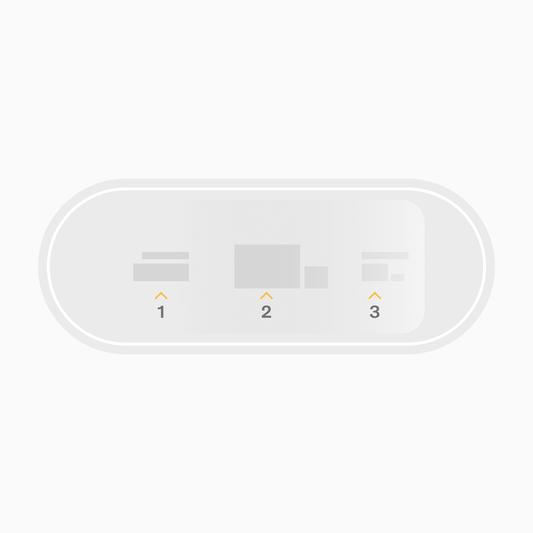
Text style roles
There are no predefined roles per text size within the global type scale. Therefore, when creating a local type scale, the roles assigned to each text style depend on the needs of the platform. To avoid the risk of introducing too many roles into a local type scale, here are some recommendations to work with:
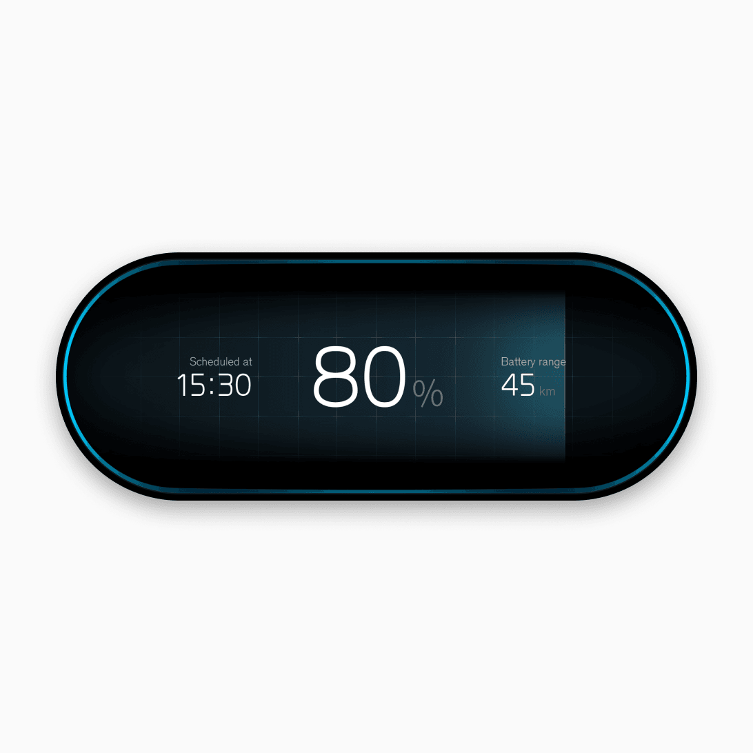
Numerics
Use numeric text styles for displaying numerical information only. Large numbers benefit from a little negative tracking (letter spacing). We suggest a maximum of -4% with adequate testing.
Headings
Use headings to introduce pages and set the largest word-based elements of a design. Headings should be smaller than numeric text styles of the same type scale, since they must contain a string of words rather than just numbers.

Titles
Use titles to introduce and guide people through the interface. Text styles for titles should lead readers' eyes from the headings down, so they can easily scan sections.
Subtitles
Use a subtitle style to introduce subsections of content. This style is a little larger than body copy, and can be used for smaller titles, or for emphasising a block of copy like a pull quote or lead sentences.

Overlines
Use an overline text style in cases where the underlying text would benefit from the inclusion of a small label or visual "tag" above it. Overline styles are mainly used for categorisation or with editorialised content such as long-form articles.
Body copy
Body copy styles are used to set the majority of textual information in UI.
We recommend 3 levels of body copy hierarchy:
- Body primary
- Body secondary
- Body tertiary
Body tertiary is used for microcopy and is always the smallest text size on a given type scale. Use body tertiary for legal disclaimers, e.g. terms and conditions. Body copy may feature inline links across all 3 text sizes. Consider the variants needed per style.
Text style variants
For all body copy text styles, we recommend creating an 'emphasis' (medium), 'standard' (semi-light), and 'link' (underlined) variant. This may result in 9 text styles to cover body copy alone, within a given type scale.
Button labels
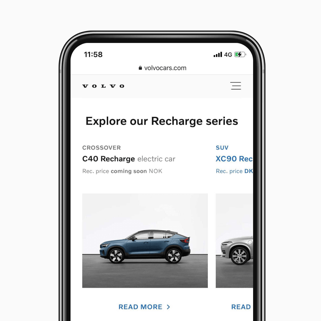
Use a button label text style within all primary call-to-actions. This style can also be used for all secondary button text which is set in uppercase, with positive tracking and a right-pointing chevron icon (>).
We currently have 1 text style for buttons, which serves:
- Button labels (text within primary call-to-actions)
- Button text for secondary actions (outlined or as standalone text)
Guidance
Always maintain numeric rhythm when forming local type scales. Ensure that all text style sizes are contrasting from one another to support clear visual hierarchy. We recommend 12pt (1.5x) as the smallest accessible text size.
For context, here's an example of the local type scale currently used across the mobile native platforms at Volvo Cars and consists of 11 text styles.
Each local type scales are stored (and published for use) from their respective Figma platform libraries.