Grids
Grids provide the foundation for organising visual elements and typography. Using a grid is an essential part of our design process to ensure precision, order, and clarity within and across platforms.
How it works
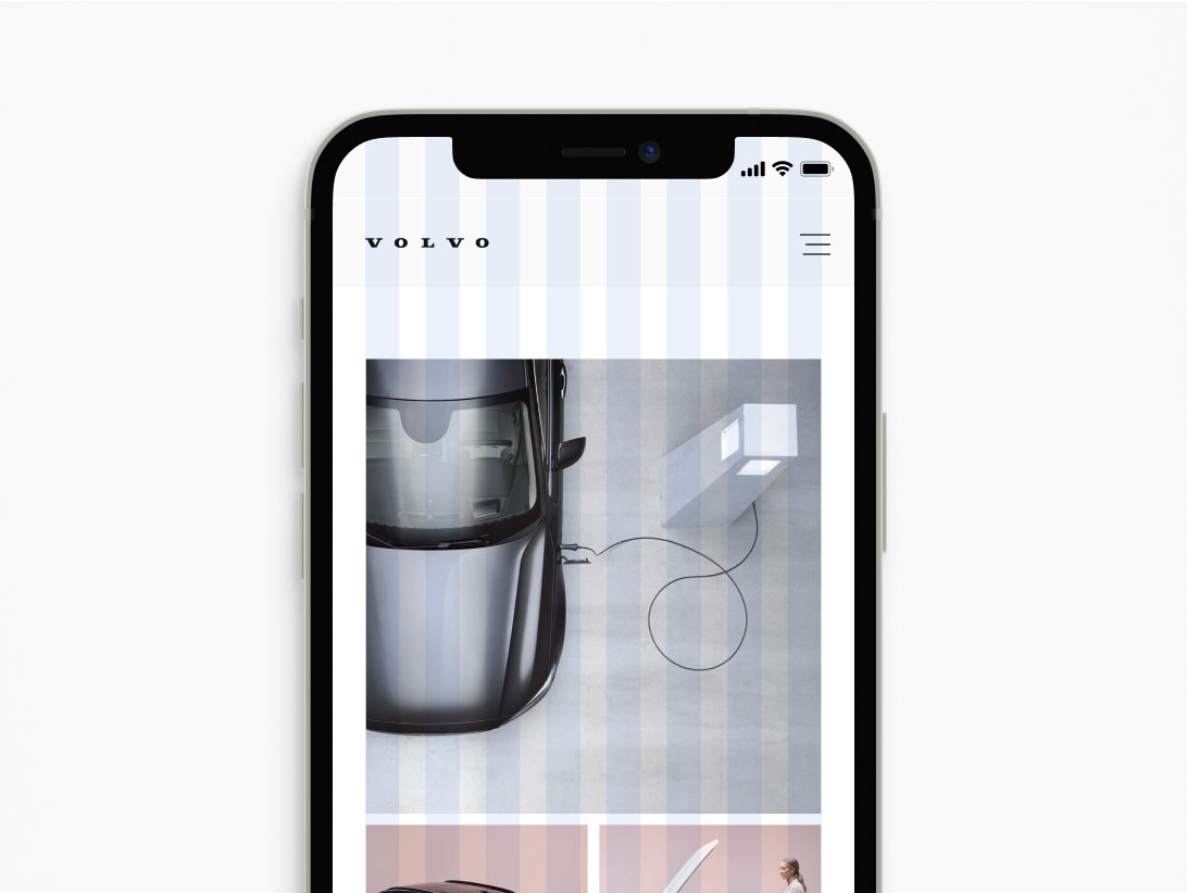
Grids are sets of vertical and/or horizontal lines used strategically to define rules for how design elements like image size, placement and even white space will be structured in a layout. Whether it's for print packaging, business cards, websites, or apps, a grid defines the rhythm of a person's experience with our design. Having a common approach to grids ensures we're creating a consistent visual identity across every Volvo Cars platform.
Dividing the grid
When constructing a grid for a new design, we use divisions as a guide. Establish the proper layout size, then start a grid by dividing it into two even columns. Then, divide each column by two, and repeat as needed. This method can be applied to most designs.
Grid flexibility
Create a grid that meets your design requirements. Your format and design elements will determine the structure, complexity, and density of your grid.


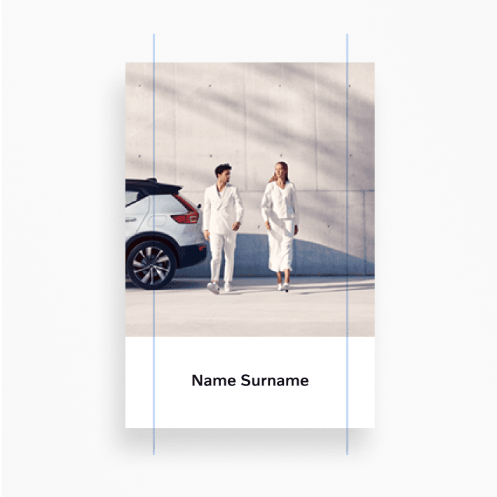
Margins
Margins control the space between the edges of the grid and content. Use the divisional method as a guide to define margin widths whenever applicable. When creating margins, be mindful of the impact of different predetermined production methods, as well as accounting for formats where the divisional method cannot be used. Ensure margin widths and related ratios work for all platforms and display devices.


.svg?w=1920)
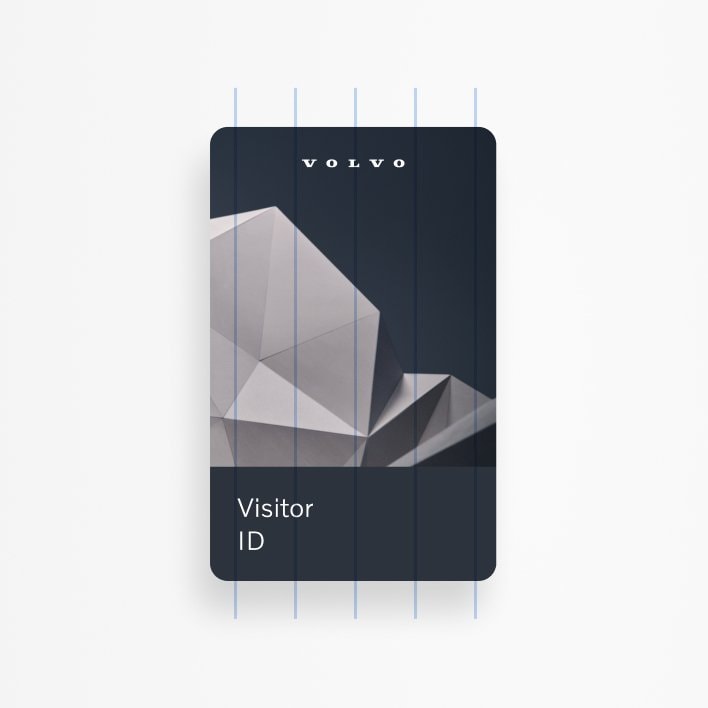
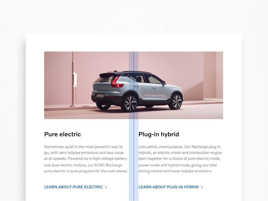
Columns
Column grids are the most common. You can use the divisional method as a guide when creating columns. Place design elements within these columns. Keep your choice of column grid throughout your design to maintain consistency.


.png?w=1920)

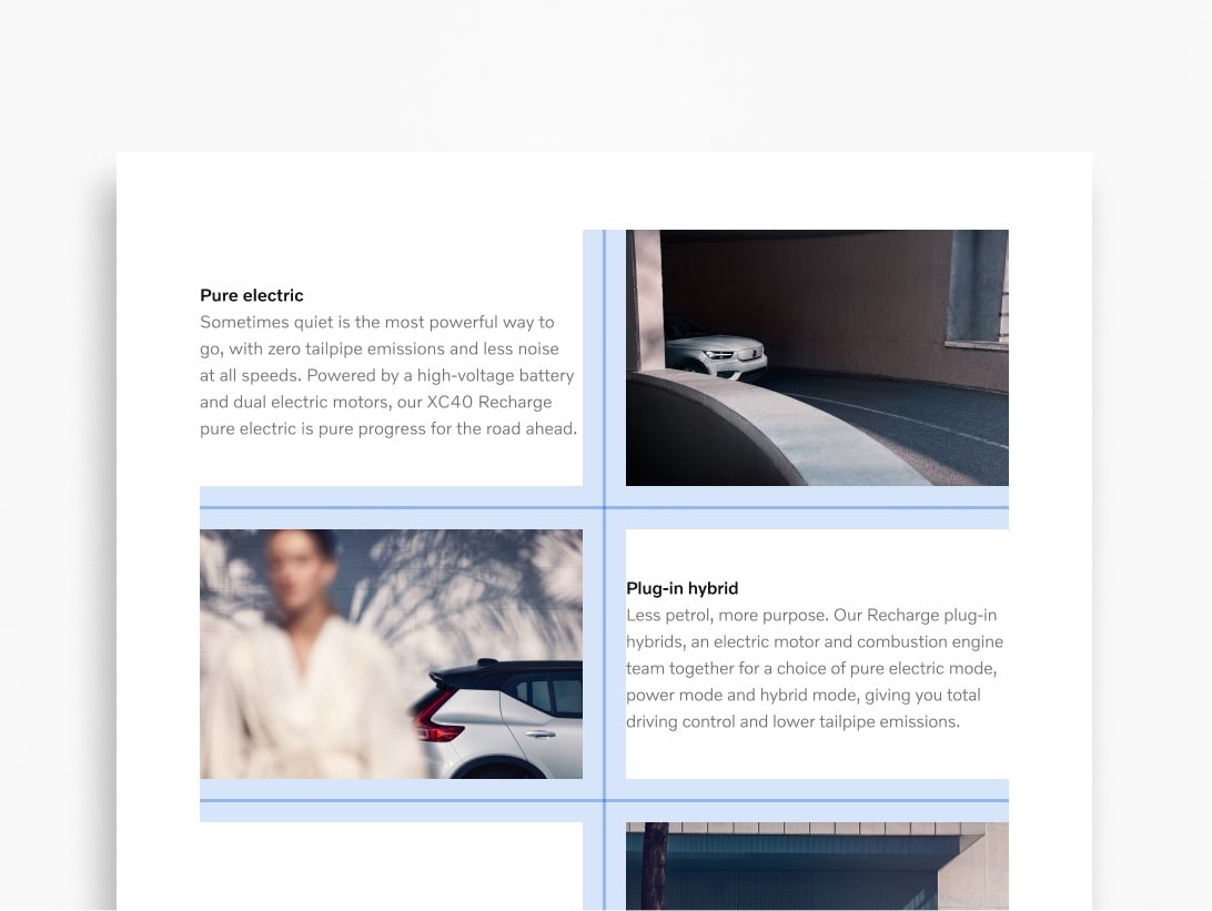
Modules
A modular grid is used to introduce additional layout control horizontally on the screen or page you're designing. A modular grid is basically a column grid with rows added. These vertical and horizontal lines create blocks or "modules." You can also use the divisional method as a guide when creating a modular grid.


.png?w=1920)
Gutters
Gutters are an important feature of any grid. These spaces clearly separate text blocks. You can continue to use the divisional method as a guide to create gutters. The gutter width should be consistent across your designs. Always align text to the gutters.


.png?w=1920)
Spacers
Spacers determine the amount of white space preserved throughout the design. Space improves readability and legibility, enhances visual aesthetics, and builds a consistent design. You can use the divisional method as a guide to defining your ideal spacers.


.png?w=1920)
.png?w=1920)