Brand colours
Colour is a key factor in the Volvo Cars design system. Used correctly, it creates a consistent brand expression and distinct identity, and helps define our refined, understated aesthetic.
Brand colour palette
Our colour palette consists of timeless, versatile blue and grey colours, as well as accent colours. Blues and greys are used in most contexts. Accent colours should be used sparingly. Exceptions apply and will be directed by the central creative strategy for specific activities or campaigns.
Blue colours
#202A44
#1B365D
#7089AC
#CED9E5
Grey colours
#53565A
#888B8D
#A7A8A9
#C8C9C7
#E1DFDD
Black/White
#000000
#141414
#FFFFFF
Orange colours
#A85F02
#BF834B
#D9B48B
#F0DFC6
Red colours
#622128
#9E2A2B
#DDA69D
#F0DDD7
Green colours
#22372B
#476D3B
#A3B2A4
#E0E7D9
Balance and contrast
Contrast in colours should be applied in a balanced way. Lighter and darker colours together will make certain parts more visible and improve legibility. Use colours from the same group to maintain balance and contrast.
.png?w=1920)
.png?w=1920)
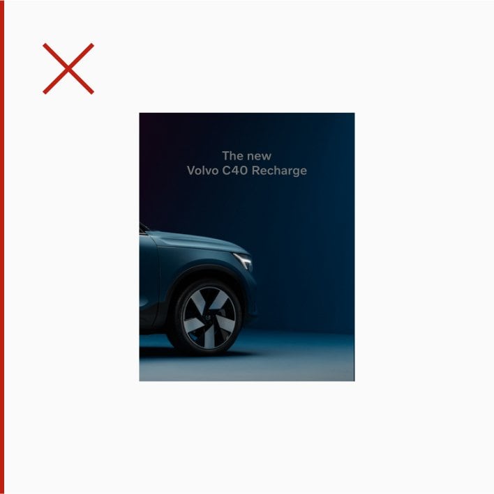
Colour and type
Finding the right balance between type colour and background makes the text easier to read. Use black text on light backgrounds and white text on dark backgrounds.


Usage
Colour is an important factor for the visual brand identity. Used correctly it creates a consistent brand expression, a distinct identity and a characteristic Scandinavian look and feel. Our colours are used in multiple areas.
.png?w=1920)
.png?w=1920)
.svg?w=1920)
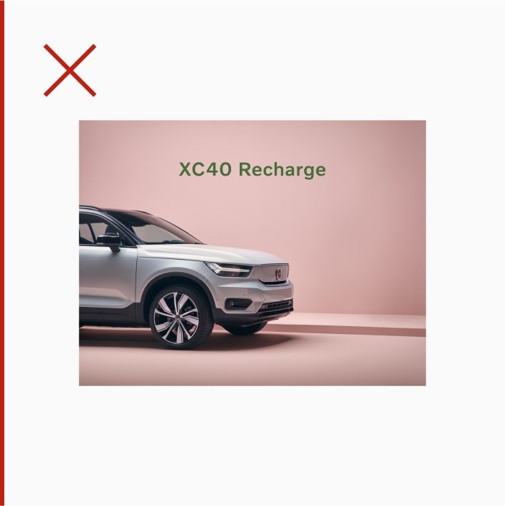
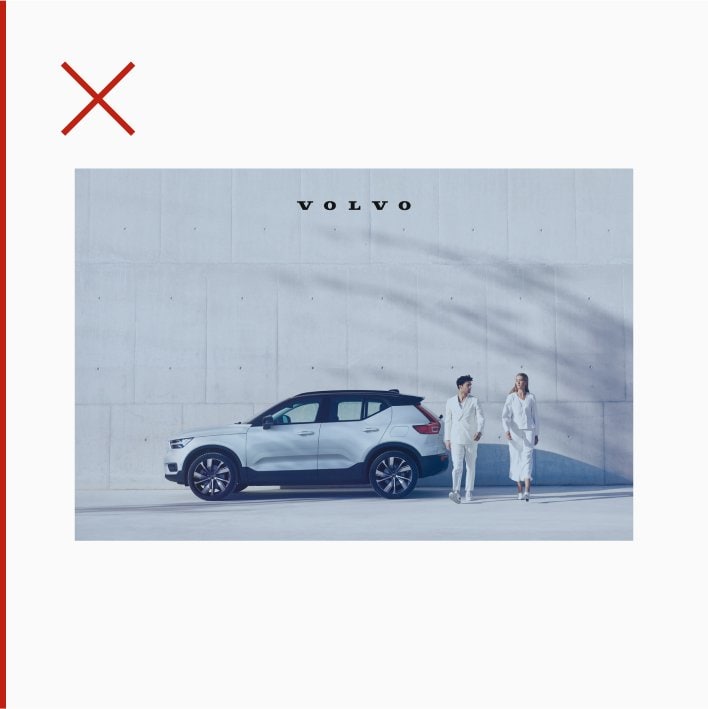
Incorrect usage
Here are examples of what to avoid.