Volvo Iron Mark
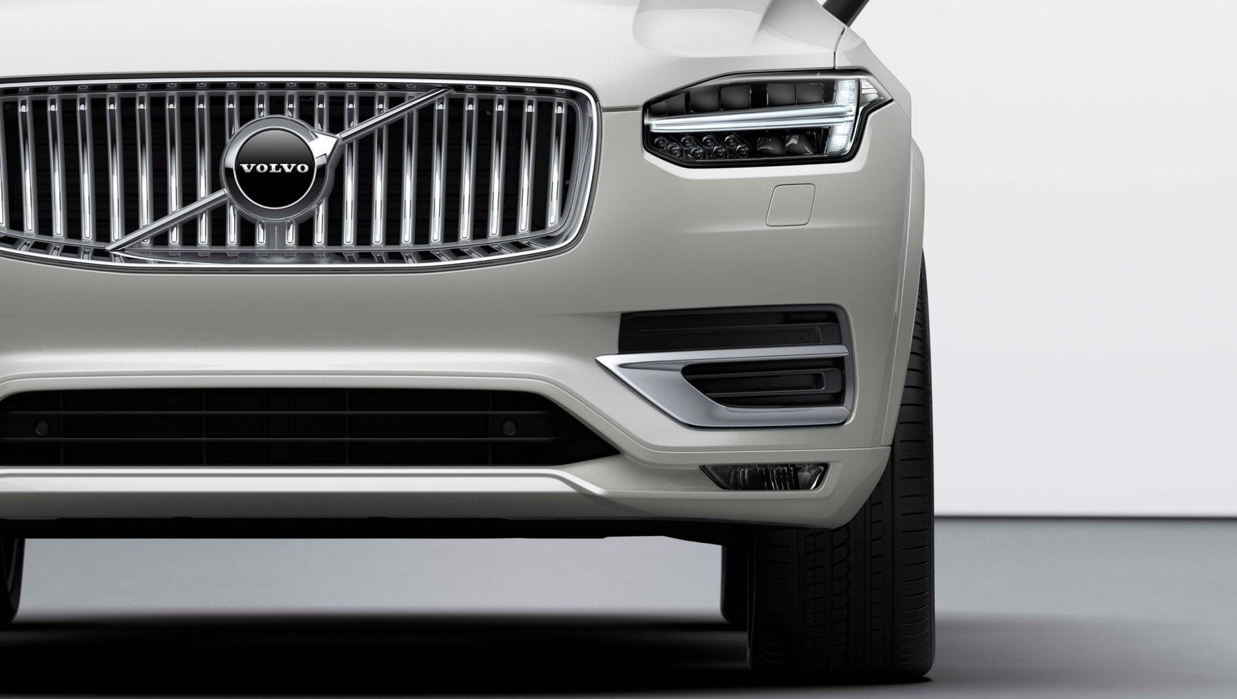
The Volvo Iron Mark is the logo we use as an emblem on the front of our cars. It also expresses our brand across digital channels. Derived from the alchemy symbol for iron, it embodies the strength and quality of Swedish steel.
Overview
The Volvo Iron Mark is ideally suited for small square (1:1) spaces such as a mobile app icon, favicon or bookmark icon. The Volvo Iron Mark is usually accompanied by the text label: 'Volvo Cars'.


Logos on products
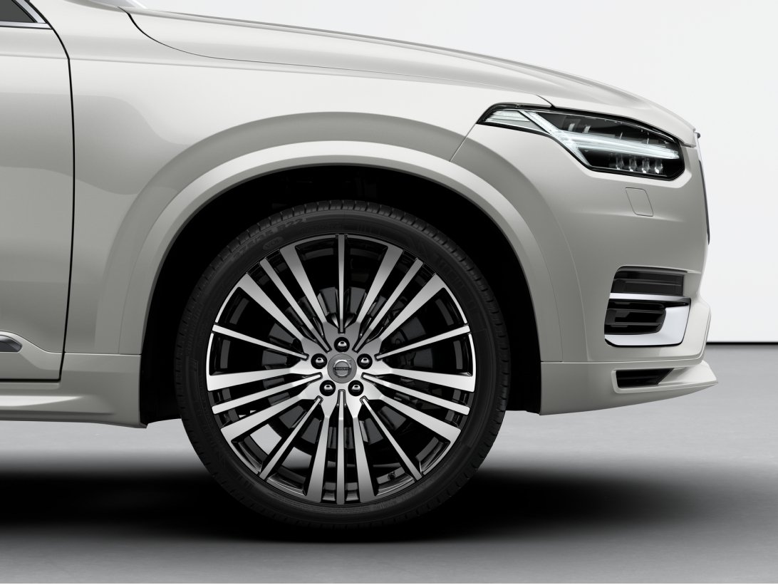
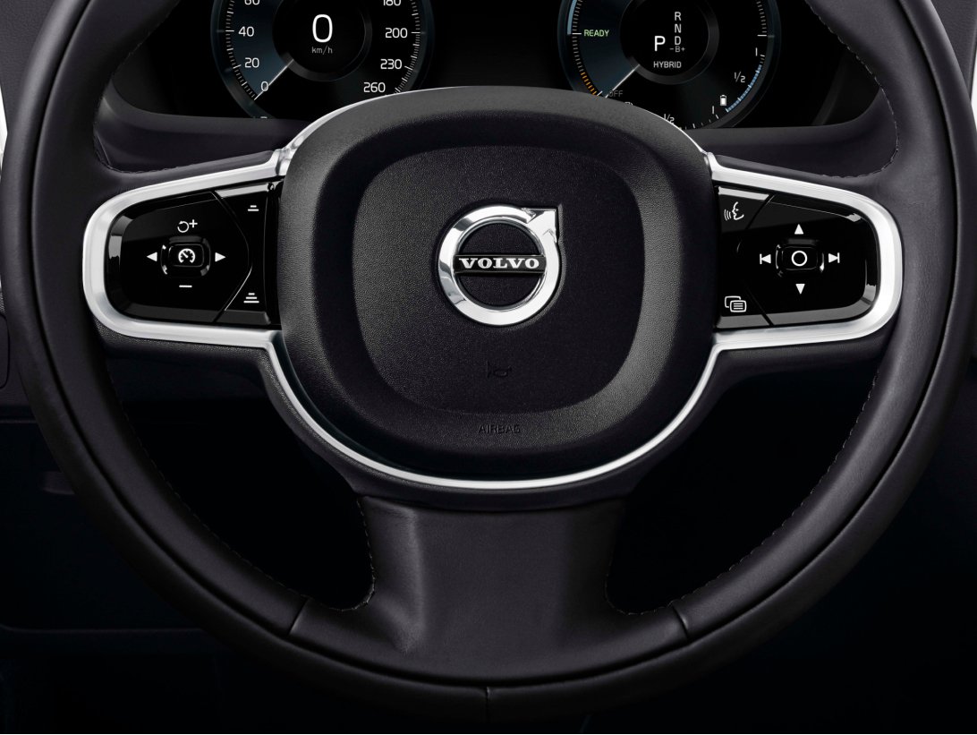
These are examples of the 3D (physical) Volvo Iron Mark, which only appears on our products.


Clear space
To maintain clarity of the Volvo Iron Mark it is essential to keep a minimum clear space around the logo. Always use the maximum resolution possible to ensure precision and quality.

Size
In order for the Volvo Iron Mark to be consistently recognisable at different sizes, it is important to have it optimised for a variety of different media spaces.
The minimum print size should be no smaller than 12 mm. For digital, the minimum size is a 16 x 16 pixel favicon. These rules cover the absolute minimum sizes, but where possible the Volvo Iron Mark should be reproduced at larger, crisper sizes.

Positioning
The Volvo Iron Mark is always positioned in the centre of any prescribed area, whether used for social media, mobile app icons, or as a favicon for our websites. Maintain the minimum clear space around the logo. The logo used for the website favicon is exempt from clear space rules, and is instead sized to best fit the available area. Always safeguard the quality and legibility of the logo.


Colouring
Black is the default colour for the Volvo Iron Mark. The white variant is to be used on dark backgrounds and/or images. Legibility is a priority, to meet legal requirements for contrast and clarity.


Incorrect usage
To uphold a consistent brand identity, we always treat the Volvo Iron Mark correctly in terms of style, size, positioning, and orientation. This is also required for legal reasons.


