logos

Volvo Spread Word Mark

The Volvo Spread Word Mark is used in marketing and communication. This spaced out logo provides an elegant expression of our brand.

Overview

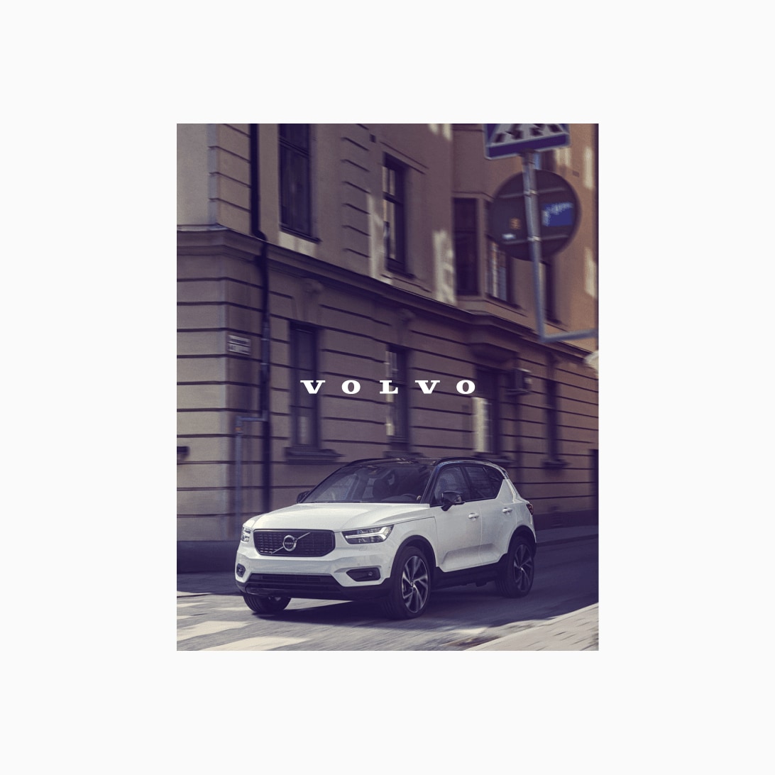
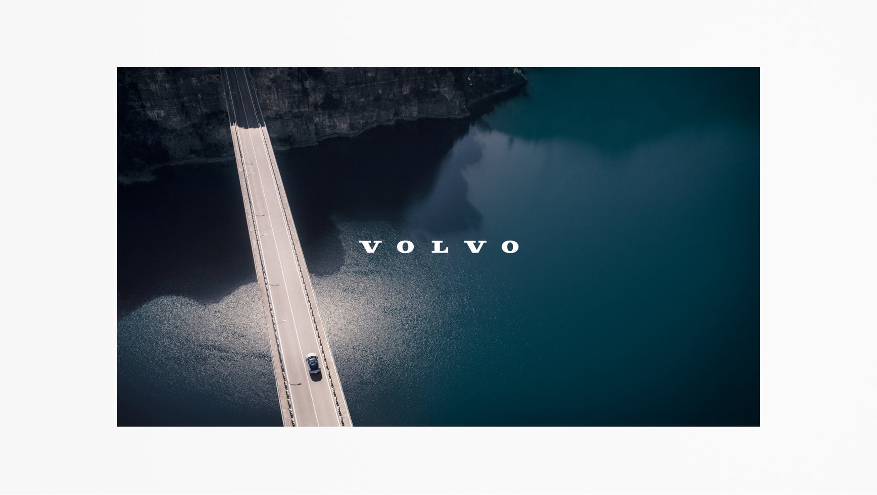
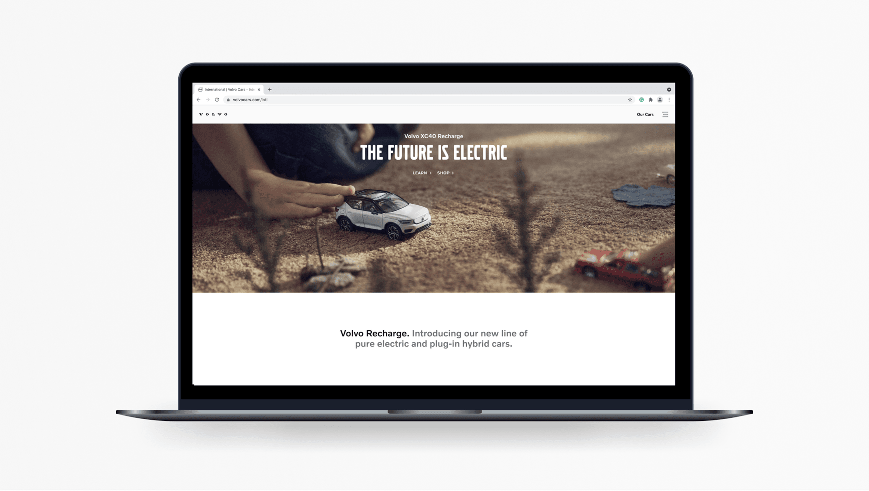
The proportions of the Volvo Spread Word Mark make it ideal for use in narrow horizontal contexts, such as the top of our websites.
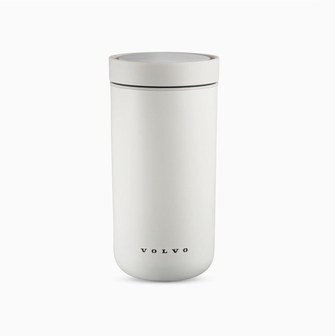
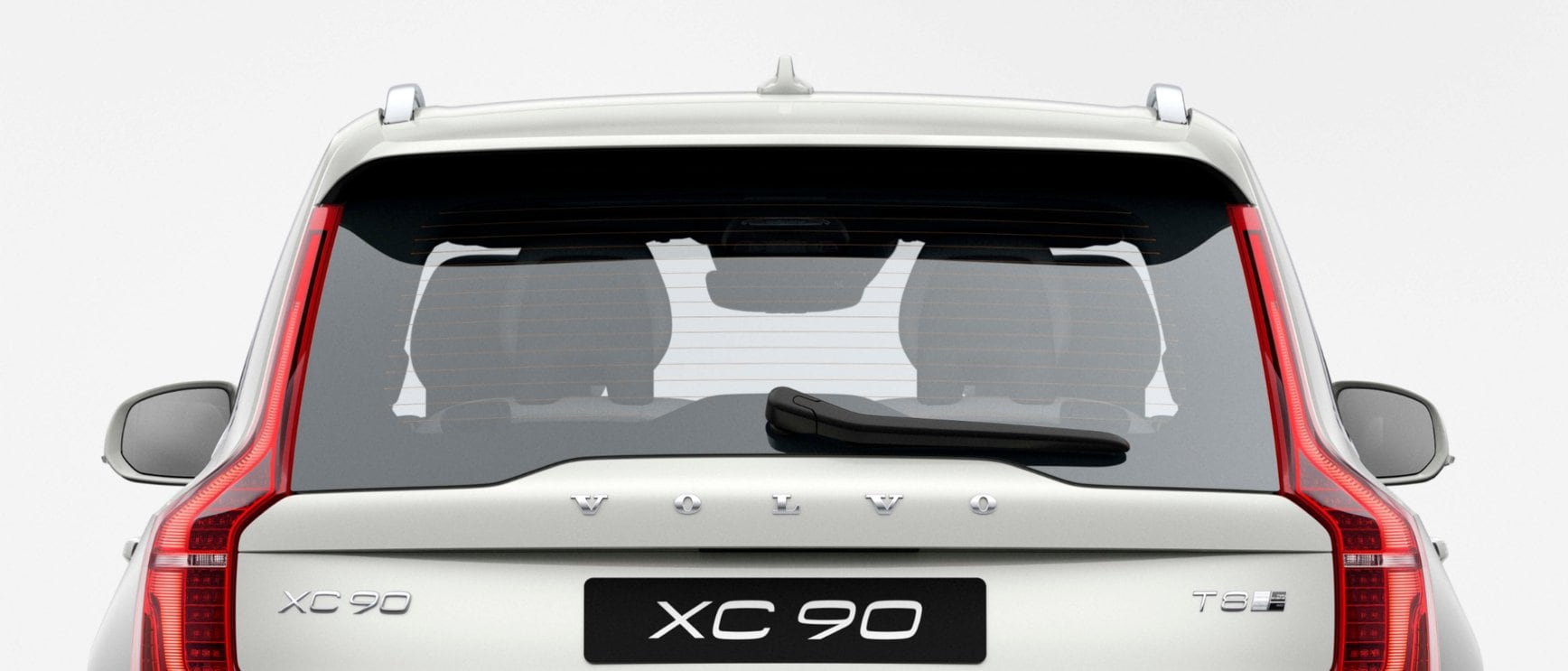
Laptop visual showing the usage of the Volvo Spread Word Mark on the primary navigation bar of volvocars.com.
The Volvo Spread Word Mark (top left) as seen in the primary navigation bar of our websites. In this context the logo does not to need to follow the standard exclusion zone.
End of a social media video post. The picture/video of an XC40 driving in a city and stopping at a pedestrian crossing. The Volvo Spread Word Mark appears as a picture/video overlay, in the middle of the screen.
End of video in social media.
A white cylindrical water bottle/thermos with a screw-top lid. Printed  in black at the centre/bottom of the bottle is the Volvo Spread Word Mark.
Merchandise products.

Logos on products

The following example shows the 3D Volvo Spread Word Mark as it appears on the rear of our cars.

Photograph of the rear of a Volvo XC90, showing the physical Volvo Spread Word Mark applied to the bodywork.
The 3D Volvo Spread Word Mark is only found on our cars.

Clear space

To maintain clarity and integrity of the Volvo Spread Word Mark it is essential to keep the minimum clear space around the logotype. Always use the highest resolution possible for a crisp finish.

The clear space around the Volvo Spread Word Mark. The clear space area is coloured in light blue, with darker blue lines to indicate the minimum height of this space is equal to 3x the height of the logo. A yellow arrow points to one of the 3x height measurements to show what the 1x base height measurement looks like.
The minimum clear space for the Volvo Spread Word Mark is always 3x its height. No other elements may sit within this established exclusion zone.

Exclusion zone exemptions

There are instances where the designer may be exempt from having to respect the exclusion zone of the Volvo Spread Word Mark. This typically occurs in cases where the surrounding area of a brand asset is limited in width and/or height.

Size

To ensure the Volvo Spread Word Mark remains legible in different contexts, it must be sized relative to the format. The size is different for each format, in order to present the brand in a clear, relevant and consistent way.

The width of the Volvo Spread Word Mark varies according to the total width of the format on which it is to appear.

A line art illustration of a square digital banner. The Volvo Spread Word Mark is positioned top centre. Two yellow lines, one on each side of the logo indicate the width of the logo, which is 1/3 of the width of the format. Below the logo is an illustration of how the size of the logo is established. A light blue horizontal bar runs along the full width of the format. Two darker blue lines divide this bar into three equal parts, one of which determined the total width of the logo for this particular format.
Digital banner, square format.
A line art illustration of a rectangular digital banner. The Volvo Spread Word Mark is positioned centre. Two yellow lines, one on each side of the logo indicate the width of the logo, which is 1/4 of the width of the format. Below the logo is an illustration of how the size of the logo is established. A light blue horizontal bar runs along the full width of the format. Three darker blue lines divide this bar into four equal parts, one of which determined the total width of the logo for this particular format.
End of a video, wide layout.

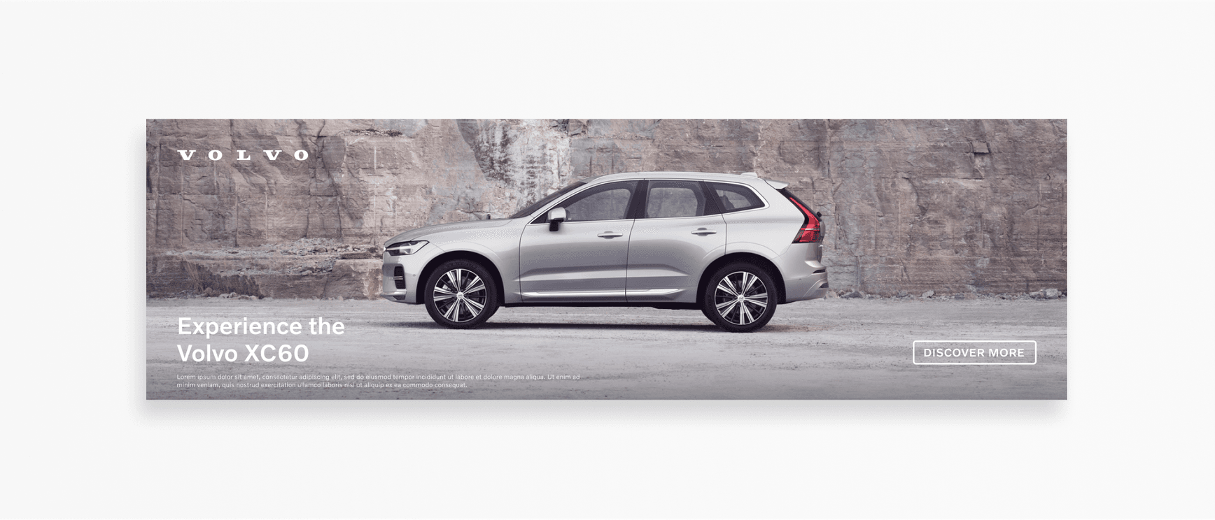
Size for digital banners

  • Portrait: Logo width is one quarter (1/4) of the format.
  • Portrait tall/narrow: Logo width is one half (1/2) of the format.
  • Landscape: Logo size is one sixth (1/6) of the format.
  • Landscape wide/narrow: Logo width is one quarter (1/4) of the format.
  • Square: Logo size is one third (1/3) of the format.

Size for print and outdoor advertising

  • Roll-up: Logo width is one third (1/3) of the format.
  • Portrait: Logo width is one quarter (1/4) of the format.
  • Landscape: Logo width is one sixth (1/6) of the format.

Size for end of video

  • Wide: Logo width is one quarter (1/4) of the frame width.
  • Square: Logo width is two fifth (2/5) of the frame width.
  • Tall: Logo width is two fifth (2/5) of the frame width.

Minimum sizes

  • Digital: A minimum height of 8 px is established for the Volvo Spread Word Mark.
  • Print: A minimum width of 20 mm is established for the Volvo Spread Word Mark.

Before resizing logos in your designs, always ensure 'constrain proportions' is checked. By doing so you avoid accidentally warping our brand elements.

A desktop view close-up, showing a generic browser tab for
Volvo Spread Word Mark as it appears on volvocars.com/intl.

Positioning

The default position of the Volvo Spread Word Mark is in the centre, either at the top or bottom of the prescribed area. Consider the narrative and context when choosing either top or bottom positioning. Positioning is flexible, to help designers meet requirements and maintain relevance.

A line art illustration of a square format. The Volvo Spread Word Mark is situated top centre. A light blue line runs vertically down the centre of the illustration to denote the centre positioning.
Top centre position on a square digital banner. Always maintain the clear space. Only use one logo per layout.
A line art illustration of a square format. The Volvo Spread Word Mark is situated bottom centre. A light blue line runs vertically down the centre of the illustration to denote the centre positioning.
Bottom centre position on a square digital banner. Always maintain the clear space. Only use one logo per layout.
This aerial image represents an end of video context (in a widescreen format). The photo is of a car driving over a suspension bridge, with a body of water underneath. The Volvo Spread Word Mark is positioned in the centre of the photo. It contrasts well, being set in white, on the dark water in the background.
End of video, Volvo Spread Word Mark.

Positioning alternatives

In certain formats the default position of the Volvo Spread Word Mark is not possible, nor effective. In such cases exceptions are made to use this mark in a corner position. When choosing a corner position, consider the background elements, any crop margins, and the word mark clear space.

A line art illustration of two landscape/wide formats. The top format is showing the Volvo Spread Word Mark in the top left corner and the bottom format is showing the logo in the bottom left corner. A light blue line run vertically down both formats on the left side, to indicate a left alignment.
Top and bottom left corner positioning of the Volvo Spread Word Mark, on digital banners.
A line art illustration of two landscape/wide formats. The top format is showing the Volvo Spread Word Mark in the top right corner, and the bottom format is showing the logo in the bottom right corner. A light blue line runs vertically down both formats on the right side to indicate a right alignment.
Top and bottom right corner positioning of the Volvo Spread Word Mark, on digital banners.
A desktop image shows the Volvo Spread Word Mark in the top left corner of the website header.
Volvo Spread Word Mark: A left position is required on the header of volvocars.com due to the form factor and browser functionality.
A landscape/wide image shows the Volvo Spread Word Mark logo in the top left corner. The photo on the banner is a left side view of a Volvo XC60. The car appears to be in a quarry, or at the base of a large exposed rock face. There is copy that reads: 'Experience the Volvo XC60' in the bottom left corner, along with two lines of microcopy underneath. A call-to-action button that reads: 'Discover More' appears in the bottom right corner.
A corner logo position is required with certain formats, e.g. a wide digital banner. Always ensure the logo clear space is respected and legibility is maintained. Never obstruct the main focus of our product images, even when working with the brand logos.

Colouring

Black is the default colour for the Volvo Spread Word Mark. The white variant is to be used on dark backgrounds and/or images. Legibility is a priority, to meet legal requirements for contrast and clarity.

An illustration of the Volvo Spread Word Mark in black on a white square background.
Light or dark? The background and tonality will determine which logo colour you decide to use.
An illustration of the Volvo Spread Word Mark in white on a black square background.
The preferred background colours are white (#FFFFFF) or off black (#141414).

Incorrect usage

To uphold a consistent brand identity, we always treat the Volvo Spread Word Mark correctly in terms of style, size, positioning, and orientation. This is also required for legal reasons.

Illustration of the Volvo Spread Word Mark in black, rotated. Incorrect usage.
Do not rotate the logo in any direction.
Illustration of the Volvo Spread Word Mark in black horizontally distorted/very squashed. Incorrect usage.
Do not distort the logo in any way.
Illustration of a black Volvo Spread Word Mark in black on a dark grey background. Incorrect usage.
Do not present the logo with poor contrast.
Illustration of the Volvo Spread Word Mark  in black with a tag line underneath that reads: 'Lorem ipsum'. Incorrect usage.
Do not add tag lines (respect the surrounding clear space).
Illustration of the Volvo Spread Word Mark with outlined letterforms. Incorrect usage.
Do not outline the letterforms.
Illustration of the Volvo Spread Word Mark in black with a drop shadow. Incorrect usage.
Do not use shadows, filters, or other effects.

/