Imagery

Our visual language includes images and videos. These add greater depth to our visual identity, creating a look and feel that is true to Volvo Cars, while showcasing our products and services.

Purpose

Unlike illustrations, images are photographic. All images serve to either inspire or inform. Knowing which category an image falls into helps designers determine size, placement and treatment.

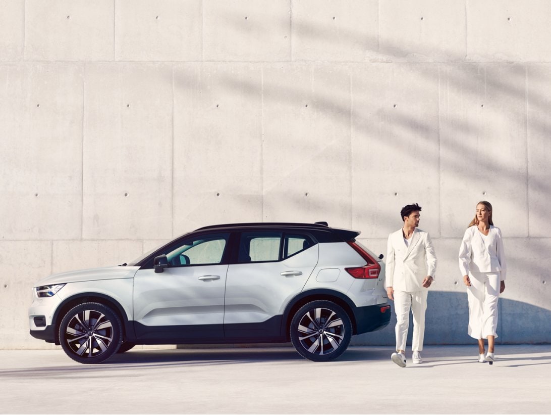
Image of XC40 recharge in a studio with pink floor and walls. There is also a charging station.
Concept studio.
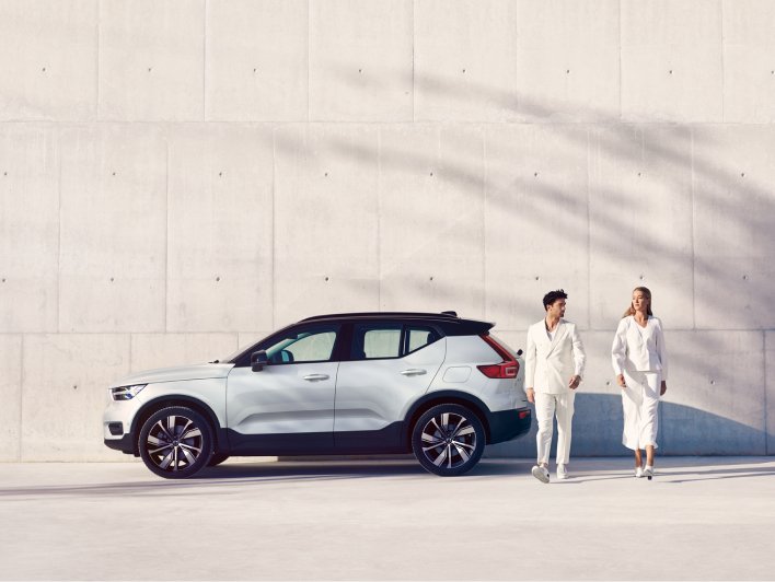
Image of XC40 recharge in a concept location. There is a man and woman in the picture with a shadow of a tree in the background. The tonality of this image is set in light beige and white.
Concept location.
image of a woman walking down stairs in a concept location. She is dressed in pink, the walls are pink stone and the staircase is in off white stone.
Storytelling.
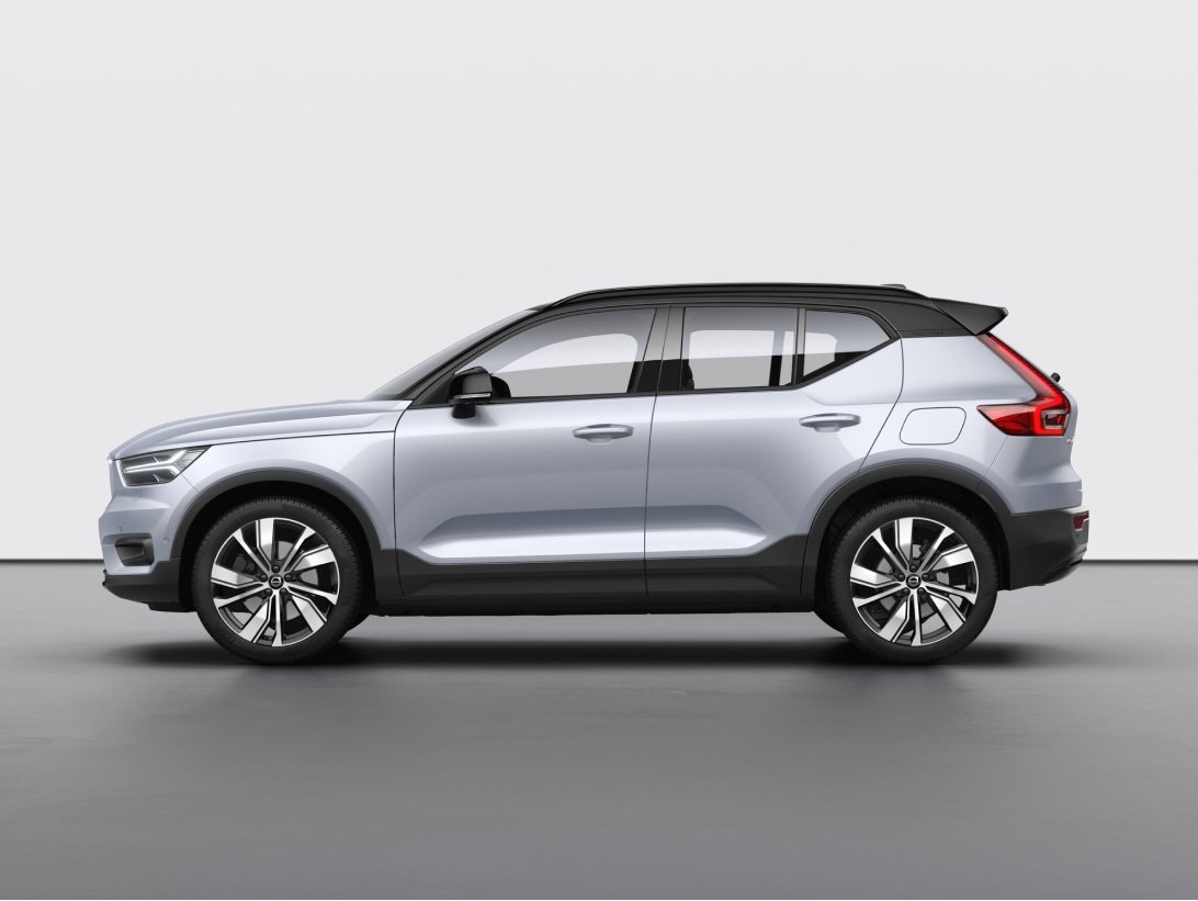
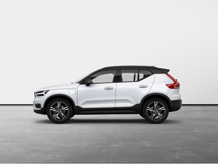
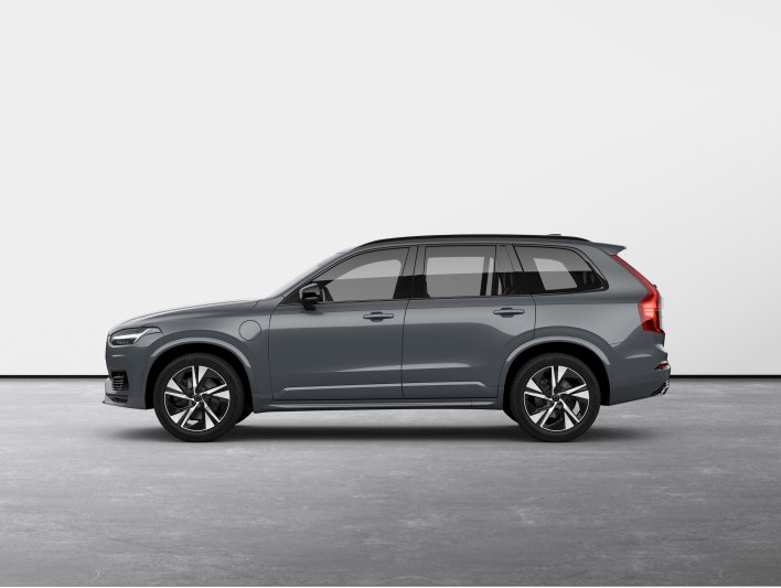
XC40 descriptive image. Descriptive images do not feature background details or information. They focus solely on the vehicles.
Descriptive.

Categories

Our visual language is grouped into four categories: Concept studio assets focus on a product’s expression in a studio environment, Concept location assets focus on a product’s expression in a natural environment, Storytelling assets create narratives by showing our products in use and Descriptive assets are functional and product-centred.

The visual language pyramid bellow highlights what we want to communicate and where our communication falls on the scales of emotional vs. rational and challenging vs. confirming. We'll continue to define the desired ratio and visual balance of these types of images for different platforms and contexts.

Image of a pyramid divided in four horizontal portions. On the left side of the pyramid from top to bottom there are numbers 1, 2, and 3. Each number points to a portion of the pyramid. Number 1 points to both concept studio (smallest portion) and concept location. Number 2 points to storytelling. And number 3 points to descriptive imagery (largest portion). This pyramid represents how often we use each category of imagery across Volvo Cars.

1. Hero assets

Hero assets include both concept studio and concept location categories. They are expressive and help draw attention from prominent positions, such as website homepages or product launch campaigns.

2. Storytelling assets

Storytelling assets are used to build captivating narratives. This is commonly used in campaigns, PR imagery, editorials and running footage.

3. Descriptive assets

Descriptive assets are functional images, videos, animations and infographics used for detailed specifications and shopping contexts. These assets have minimal or no backgrounds.

Scaling and cropping

Images should be used full-bleed whenever possible. Cropping should be used sparingly to emphasise a subject or adjusting the shape to fit a given layout. It’s important to retain the context of an image when cropping.
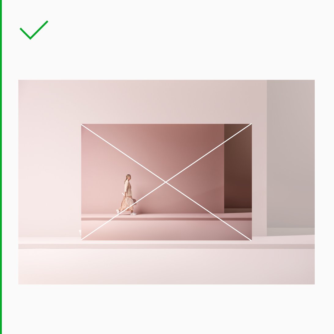
Image of a woman in a pink outfit walking with a tennis racket in a studio with pink walls and floor.
Always scale proportionally to preserve the context of the image. Adjust to the width and/or height of the format.
Image of a woman in a pink outfit walking with a tennis racket in a studio with pink walls and floor.
Always scale proportionally to preserve the context of the image. Adjust to the width and/or height of the format.
Image of a woman in a pink outfit walking with a tennis racket in a studio with pink walls and floor. In this case the intended crop is too tight around the woman. Avoid cramped imagery.
This crop lacks space around the figure of interest.
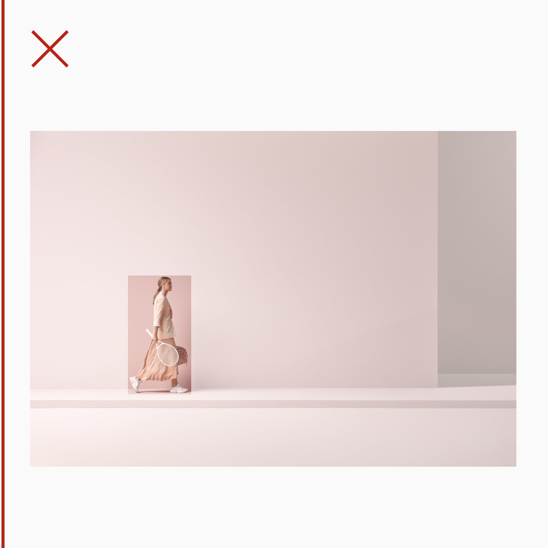
Image of a woman in a pink outfit walking with a tennis racket in a studio with pink walls and floor. This crop fails to capture the focal point clearly.
This crop fails to capture the focal point clearly.

Image and type

Images and typography are the building blocks of our communication. When combined, they can create great impact. Elements should be balanced to create a focal point for the message. Use only black or white typography on images to create contrast.

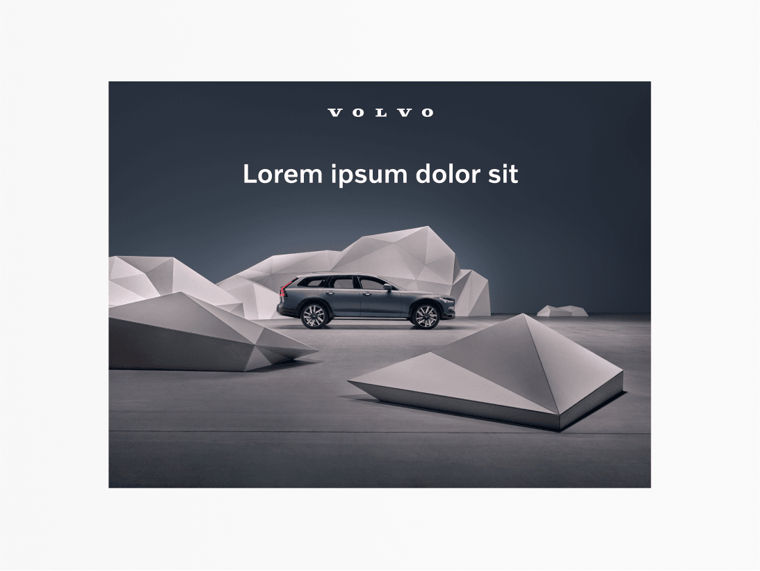
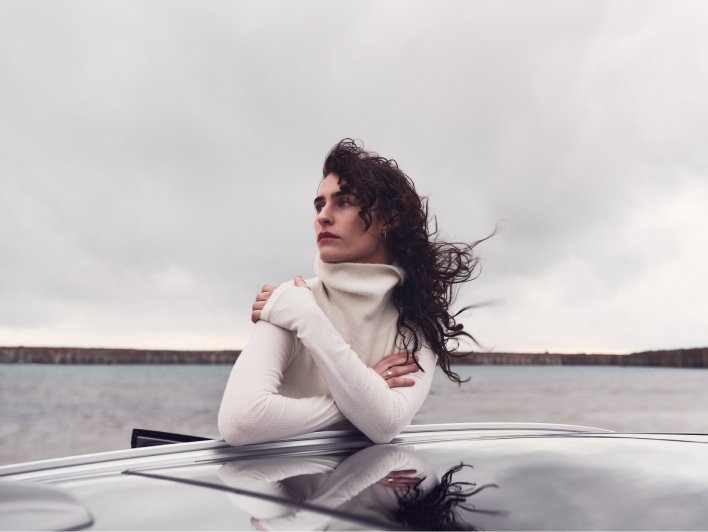
Image of a woman outdoors leaning on a car roof with the wind blowing in her hair. The sea is in the background. The sky is light grey, so this design uses a black Volvo wordmark with black heading text.
Choosing black or white type depends on the background colour and tonality on the image.
Image of a V90 in the studio with wooden polygon shapes formed as mountains in front and behind the car. The mountains are beige in colour and the walls and floor are deep blue.
The typography and logo should have the same colour.

Examples

Images and videos are vital parts of our communication. They are used on our website, in advertisements, social media and presentations to communicate our brand and its products and services.

Concept studio

Image of XC40 in a pink studio environment. The image is showing the left side of the car.
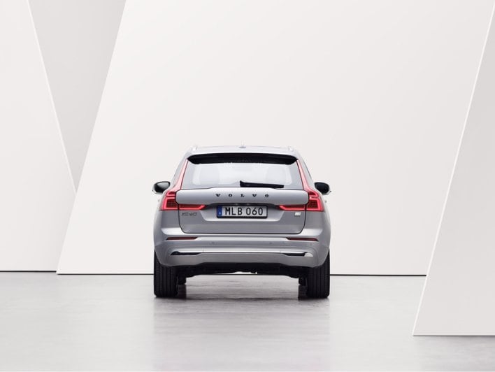
Image of XC60 in white/grey studio environment. The image is showing the rear of the car.
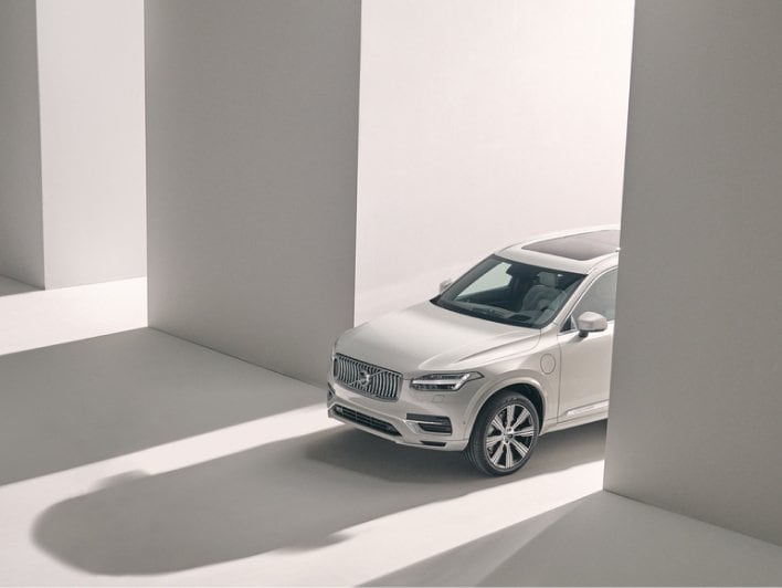
Image of XC90 in beige studio environment. The image is only showing the front half of the car. There is lots of light play, and dramatic long shadows.

Concept location

Image of XC40 recharge in a concept location. There is a man and woman in the picture with a shadow of a tree in the background. The tonality of this image is set in light beige and white.
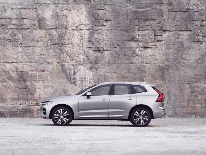
Image of XC60 in a concept location. The car is facing left. The background is a stone wall. The tonality is grey/pink-ish.
Image of XC90 in concept location. The car is facing left. The background features a grey stone wall and brick/cobble road in a beige tone. There is part of a tree on the right side, with its branches hanging above the car.

Storytelling

image of a woman walking down stairs in a concept location. She is dressed in pink, the walls are pink stone and the staircase is in off white stone.
Image of a woman outdoors leaning on a car roof with wind blowing in her hair. The sea is in the background.
Image of a woman in concept location. She is looking over her shoulder to the left. She is wearing a grey suite and the background is beige with a large shadow.

Descriptive

Descriptive image of XC40 facing left.
Descriptive image of XC60 facing left.
Descriptive image of XC90 facing left.

Incorrect usage

Here's examples of what to avoid when using imagery for Volvo Cars.
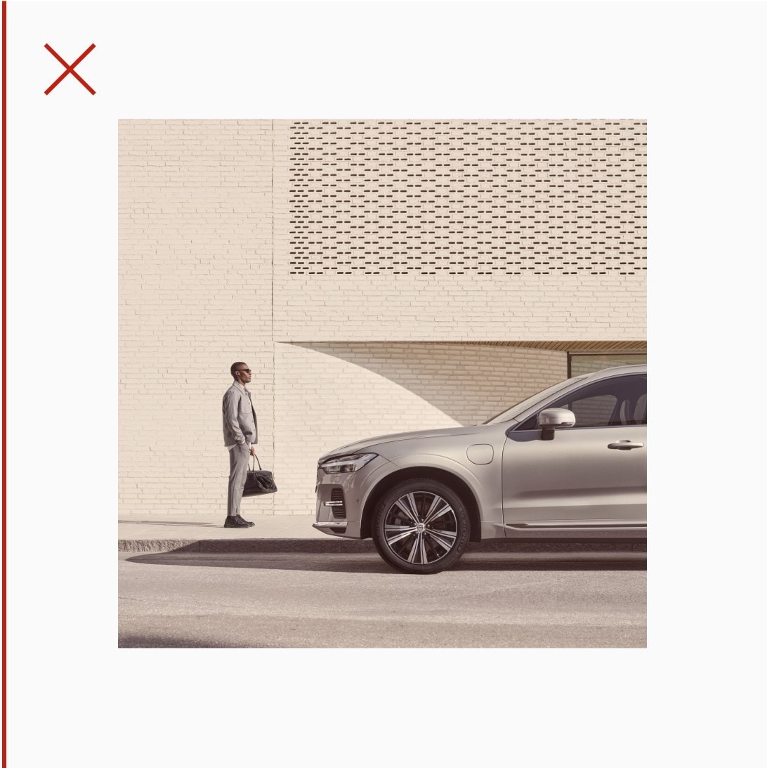
Image shows a man in front of an XC60 in a concept location. The image has a light beige tone with a yellow-ish filter on top.
Do not use any filters.
Image of XC60 in a concept location. The car is facing left. The background is a stone wall. The tonality is grey/pink-ish. This image has been rotated clockwise a few degrees, so it appears odd.
Do not rotate or distort.
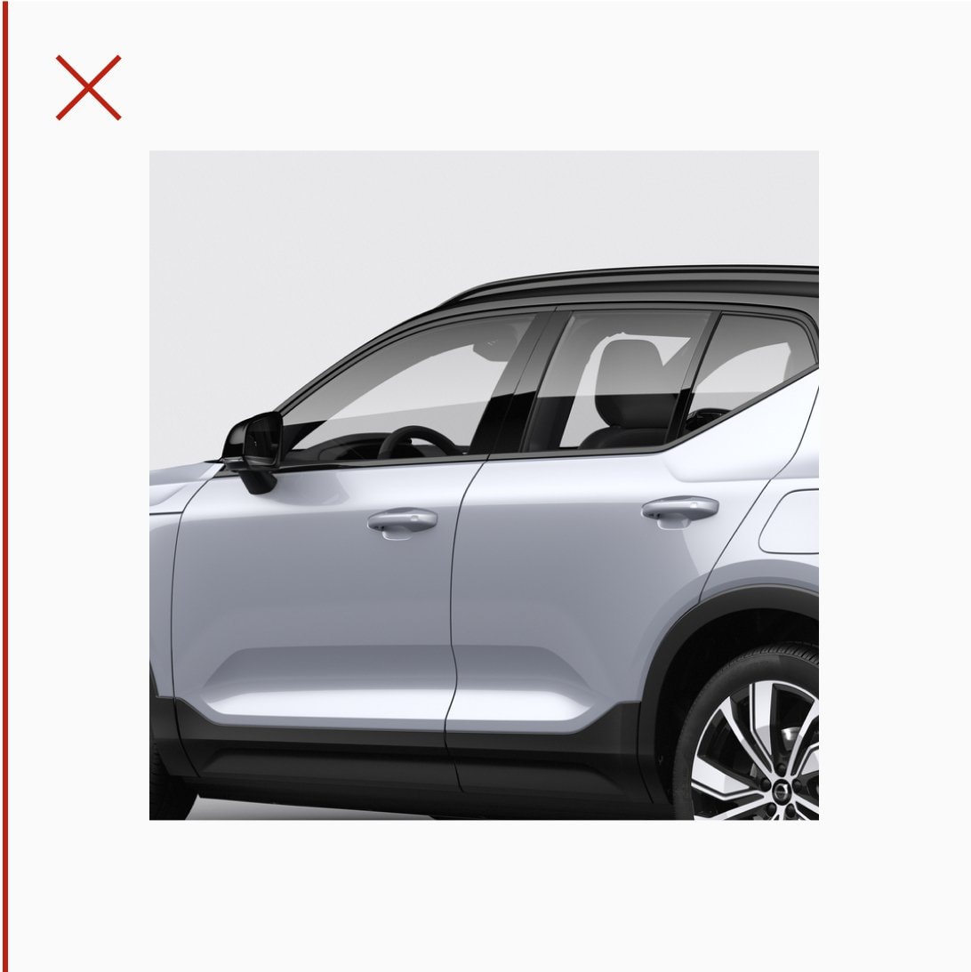
Descriptive image of XC40 facing left. The vehicle has been cropped awkwardly. Avoid this.
Do not use or crop an image that may result in poorly cut or distorted product or brand visualisation.
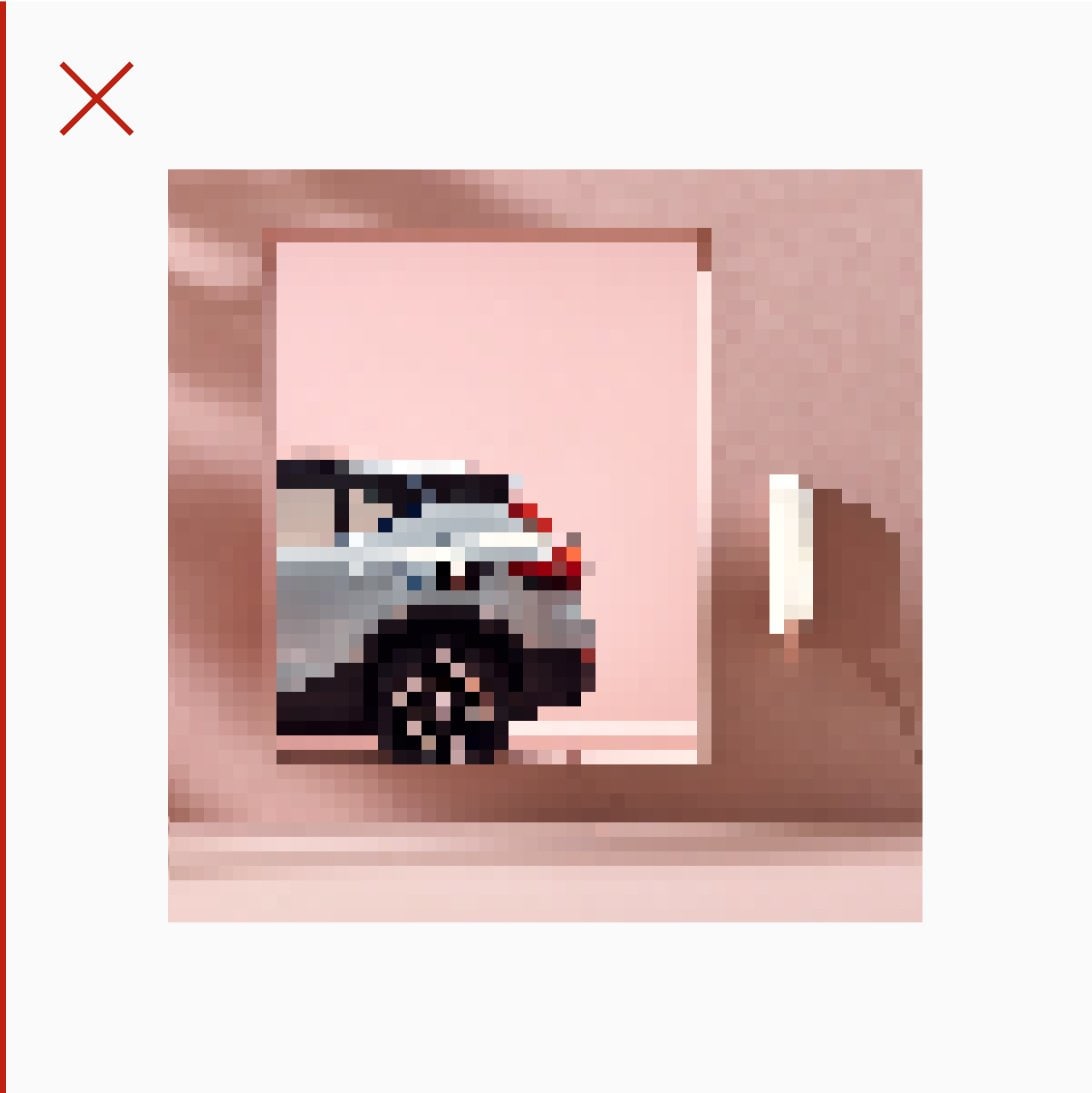
Concept studio image of XC40 in a pink room. The car is only showing the left rear side through a door opening. There is also a charger on the wall which is glowing. This image of blocky and pixelated. Imagery used across Volvo Cars must always be pin-sharp and of a very high resolution. Designers must assess the final quality of their output, especially as it enters technical implementation.
Do not use small file sizes that may result in pixelation of the image.

/